How We Increased Revenue by 280% for The Conscious Bar
There's a specific kind of frustration that comes from having a genuinely good product and still watching it underperform online. Not a broken business, just a store that looks…
There's a specific kind of frustration that comes from having a genuinely good product and still watching it underperform online. Not a broken business, just a store that looks fine, sells a product people actually want, and still can't convert the way it should. That was the position The Conscious Bar was in when they came to us.
Nothing about their brand was the problem. The way the site was set up to convert was.
We had six weeks to fix it. Not a rebuild, not a new theme from scratch: a focused conversion rate optimization project on top of their existing Shopify Plus store. No extended discovery phase, no slow rollout, no room to treat this as an open-ended redesign. Six weeks, a clear scope, and a client who needed results they could point to, not a mood board.
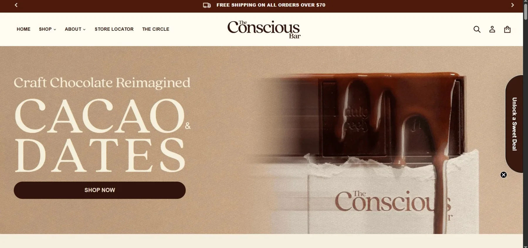
Who The Conscious Bar Is
The Conscious Bar makes cacao and date-based chocolate bars: no added sugar, vegan, paleo-friendly. It's the kind of product category where the ingredient list is the pitch. People buying this aren't looking for indulgence marketing copy; they're checking what's in the bar before they check what it tastes like.
The brand's whole identity is built around ethics and sustainability, and importantly, not as a tagline bolted onto the homepage. It runs through sourcing, packaging, and messaging, which, in a strange way, made the site's shortcomings more obvious rather than less. When a brand asks customers to trust it on ingredients and ethics, a clunky buying experience reads as a bigger inconsistency than it would for a store selling, say, phone cases. The mission raised the bar for everything else, including the parts of the site that had nothing to do with the mission at all.
Quick facts: Client: The Conscious Bar Ltd. Platform: Shopify Plus. Scope: conversion rate optimization. Timeline: six weeks.
The Starting Point: What Wasn't Working
Before we touched anything, we audited the existing store and mapped where customers were dropping off. A few things stood out immediately:
No filtering. Customers couldn't narrow products by ingredient, packaging type, or benefit. In a category where people are actively screening for things like "no added sugar" or "paleo," forcing them to click into every product page to check was a quiet way of losing them before they'd even decided.
Product pages that told a story but skipped the practical questions. The brand narrative was there. What wasn't there, at a glance, was the stuff a buyer actually needs before checkout: clear ingredient breakdowns, dietary tags, shipping specifics.
Checkout friction. Too many steps between "I want this" and "I bought this," which is exactly where good intent quietly dies.
No structure supporting organic search. URLs, hierarchy, and metadata weren't set up with discoverability in mind, so the site wasn't showing up for the searches it should have owned.
None of this is a knock on the original store. Almost every site ends up here, not because of one bad call, but because stores get built in phases, priorities shift, and small friction points pile up quietly while everyone's attention is on the next feature. The Conscious Bar wasn't an outlier. It was a normal store that had outgrown parts of its own setup.
The Optimization: What We Actually Did
This wasn't a teardown and rebuild. It was a targeted set of changes layered onto the existing store, each one aimed at a specific point of friction we'd identified in the audit.
Performance optimization for speed
Instead of a new theme, we went through the existing site's code, assets, and app stack and cut what was slowing it down: unused scripts, unoptimized images, render-blocking elements. Page speed is the first filter every visitor passes through before they even see the product, and a slow store quietly loses people before the pitch even starts. That work is directly why the store now scores 96/100 on page speed.
Filtering that matches how people actually shop
We rebuilt navigation around the questions customers were actually asking: what's in it, how is it packaged, what problem does it solve. Ingredient filters, packaging filters, and benefit-based filters replaced a flat product grid. This sounds like a small UX tweak. It isn't. It's the difference between a shopper finding what they need in ten seconds and a shopper giving up and closing the tab.
Search-friendly structure improvements
We cleaned up URLs, tightened site hierarchy, and added structured data across key pages. None of this required touching the theme itself; it was a matter of fixing the underlying setup so the store was positioned to earn organic visibility instead of fighting its own structure for it.
Retention tools
A wishlist, save-for-later functionality, and email automation gave the store ways to bring people back who weren't ready to buy on the first visit. Most first-time visitors to any store don't convert immediately; the question is whether the site gives them a reason and a mechanism to come back.
Multi-currency support
The Conscious Bar has customers beyond one region, and the original store didn't reflect that. Adding multi-currency support removed a quiet source of hesitation for international buyers. Nobody wants to do mental math or get surprised by conversion fees at checkout.
Simplified checkout
We trimmed the checkout down to fewer steps and less friction overall. This is the least glamorous part of any CRO project and consistently one of the highest-leverage. Every extra field, every unnecessary click, is a small tax on intent, and intent is the most expensive thing a store generates.
The Results
After six weeks, the numbers that matter:
+150% conversion rate
+280% revenue
96/100 page speed score
We're deliberately not including a traffic number. It wasn't something we measured cleanly during this engagement, and we'd rather leave it out than present a figure we can't fully stand behind. These three numbers are the ones we can defend, and they're the ones that actually reflect the work: more of the people who were already showing up were converting, and the store was making meaningfully more money doing it, without a rebuild or a traffic push behind it.
As Emma Lawson, founder of The Conscious Bar, put it:
"We knew our product was strong. What we didn't realize was how much the website itself was working against us. Six weeks later, it feels like a completely different business, not because the product changed, but because customers can finally experience it the way we always meant them to."
What We'd Do Differently
This is the part of the piece that's easy to skip and shouldn't be. A six-week engagement is tight by design, and tight timelines mean trade-offs, not perfection.
If we'd had more time, we'd have wanted a proper A/B testing cycle on product page layouts before locking anything in. We made confident decisions based on category research and UX principles, but confidence isn't the same as tested, and there's a real difference between "this should work better" and "we watched it work better." That's a gap we'd close given a longer runway.
We'd also have started the content and SEO strategy conversation earlier. We fixed the underlying structure for organic growth, clean URLs, and structured data, but the actual content strategy got pushed into phase two by necessity. In hindsight, even a rough version of that conversation running in parallel from week one would have meant the store was ready to compound its visibility gains sooner rather than picking that thread up after launch.
Neither of these is a complaint about the timeline. They're just the honest shape of what six weeks of focused optimization buys you versus what a longer engagement would.
The Takeaway
The lesson here isn't really about chocolate bars, or even about this specific project. It's that you don't need to tear a store down and rebuild it to move the numbers that matter. Speed, filtering, and checkout friction are conversion mechanics, not cosmetic choices, and fixing them on top of an existing store can move revenue just as much as starting over would. A fast site isn't "nice to have," it's the first gate every visitor has to clear. Clean filtering isn't a UX nicety, it's whether or not someone finds what they came for.
The Conscious Bar's product was never the problem. The store was standing in its own way, and once we cleared that friction, the numbers followed.
If your store has a product you believe in but a conversion rate that doesn't reflect it, that's usually a sign the site's working against you somewhere, not that the product needs to change, and not that you need a full rebuild to fix it. That's exactly the kind of problem we work on. If it sounds familiar, we'd be glad to take a look.
Cracktab is a Shopify Design and Development agency focused on Shopify conversion rate optimization that moves the numbers that matter: conversion, speed, and revenue. Get in touch if you're ready to find out what your store's leaving on the table.