Product Page CRO: The Elements That Actually Move Sales
The product page elements that really change conversion on Shopify stores, what to fix first, and how to tell whether it worked.
Product pages carry more weight than any other template in a store. Paid traffic lands on them, search traffic lands on them, and every browsing session ends up on one before it ends up in the cart. They're also where most stores make the same handful of mistakes, usually because the page was set up once when the theme was installed and never revisited. Here's what actually changes behavior on a Shopify product page, roughly in the order people encounter it.
What the page has to do
A product page has one job: give someone enough confidence to buy without leaving to look for the answer somewhere else. Every element either helps with that or gets in the way. A useful test when you're reviewing yours is to ask what question each block answers. If a section doesn't answer a question a real customer has, it's decoration.
Images that answer questions
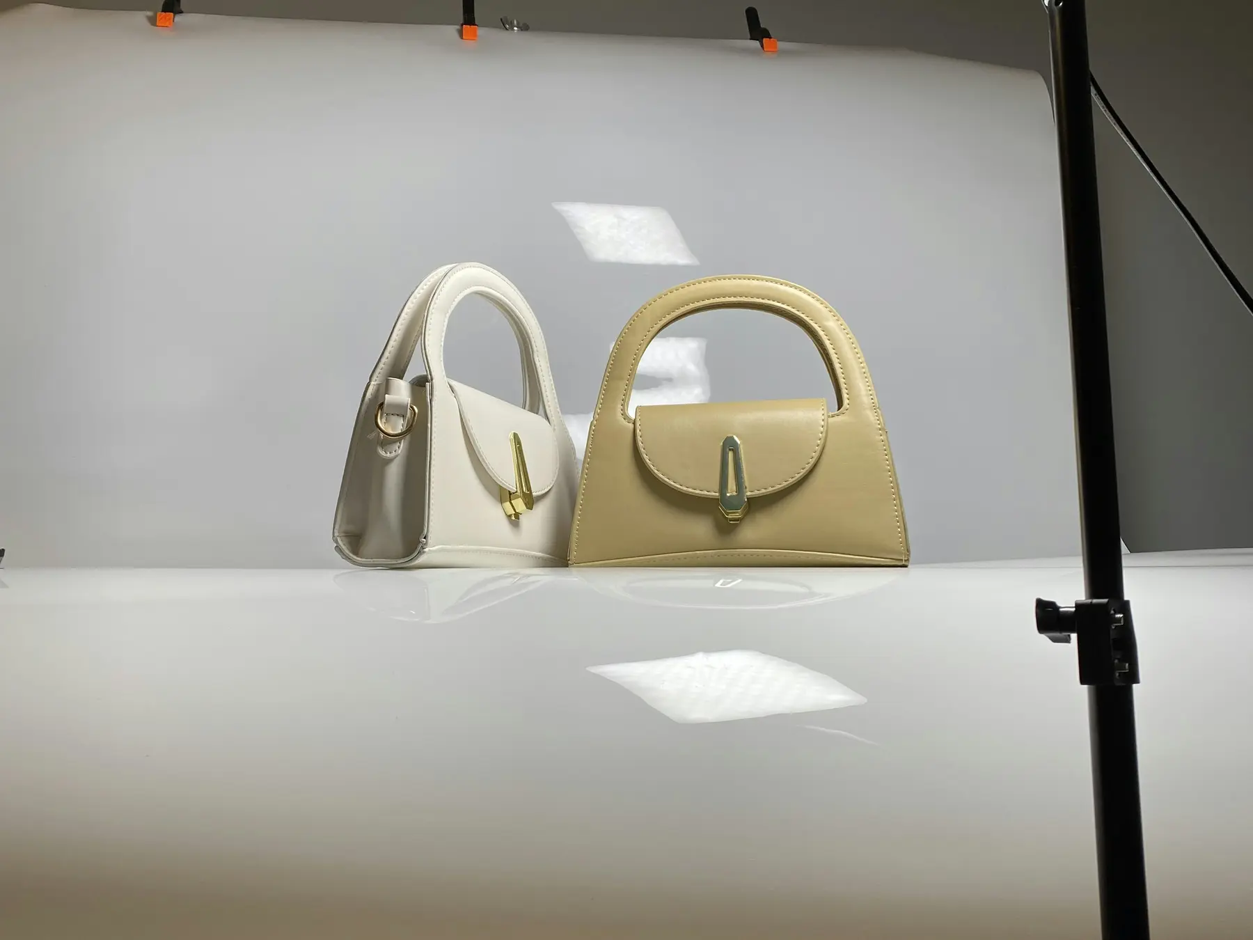
Photography does most of the selling, and the gap between stores is usually not photo quality but photo coverage. People want to see scale, texture, the parts they'll touch, and what it looks like in a real setting rather than on white. For clothing, that means the garment on different body types. For furniture, it means a shot with something familiar next to it so the size registers.
Some things worth checking on your own gallery:
Is there a shot that shows how big the thing actually is?
Can someone zoom far enough to see the material?
Does the first image work as a thumbnail at phone size, or is it a wide lifestyle shot where the product is tiny?
When a shopper picks a variant, does the gallery jump to that variant's photo?
Video helps for anything with movement or assembly, but keep it short and don't let it push the buy button off the screen on mobile.
Title, price, and the part people read first
The top block is where most decisions start. Keep the title descriptive rather than clever, since it's also what shows in search results and in the cart. Put the price where it's expected, and if there's a compare-at price, make sure it's honest.
Variant pickers that don't confuse people
Long dropdowns are a common cause of quiet drop-off. Colors do better as swatches, sizes as buttons. Show which options are unavailable rather than hiding them, so people understand what exists. And if variants change the price, update it immediately when they choose, not after they add to cart.
Say what happens with tax and shipping
A single line near the price that explains shipping cost or the free shipping threshold prevents a surprise later. This is the same friction that shows up at the cart, handled earlier where it's cheaper.
Size, fit, and specifications
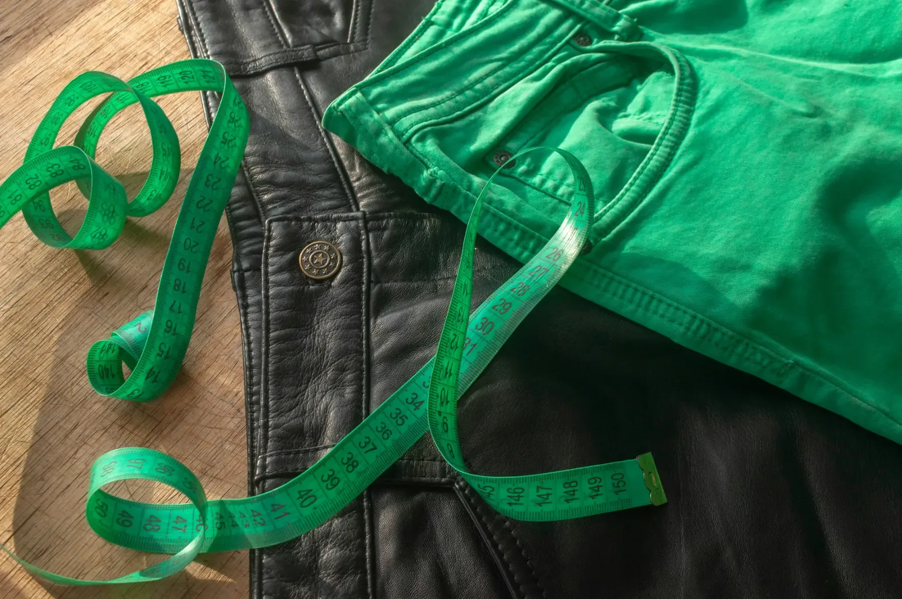
Most returns start here. If people have to guess whether a medium is your medium or the medium they wear from another brand, some of them will order two sizes and send one back, and others won't order at all.
Give real measurements, not just letters. For apparel, garment measurements plus the model's height and the size they're wearing. For anything technical, a spec table with the numbers people compare: dimensions, weight, materials, power, compatibility. Put it on the page rather than in a downloadable PDF, and keep it in a section people can jump to rather than buried at the bottom of a long description.
Delivery, returns, and stock
These three answer the question "what happens after I pay," and they belong near the buy button, not only in the footer policy pages.
Delivery: a realistic window, not a vague "ships fast." If it's made to order, say that here.
Returns: how long they have and who pays return shipping, in one sentence, linked to the full policy.
Stock: low stock messaging works when it's true and backfires when every product has claimed two left in stock for six months.
Reviews that do actual work
A star rating near the title, and the reviews themselves further down, is the pattern most shoppers expect. What makes reviews useful is specificity. Reviews mentioning fit, durability, or how something performed after a few months do more than a wall of five-star "great product" entries.
Show the unfiltered rating, including the middling ones. A product with 4.6 stars and a few critical reviews reads as real. A product with nothing but perfect scores reads as managed. If you have photo reviews, use them, since they answer the same questions your product photography does.
The buy area on mobile
Most stores get more than half their traffic on phones, and the mobile product page is usually where the layout compromises land. Check yours on an actual device:
Can you reach the add-to-cart button with a thumb without scrolling far?
Does a sticky bar keep price and buy available once people scroll into the description?
Do the variant buttons have enough space between them to tap accurately?
Does a chat bubble or a cookie banner cover the button?
After add to cart, is it obvious what happened and how to get to checkout?
What to cut
Product pages tend to accumulate. Cross-sell carousels stacked three deep, an Instagram feed, a newsletter block, a badge row, a second review widget nobody removed. Each one pushes the things that actually sell further down the page. If a section has been there for a year and you can't say what it does for conversion, that's a candidate for removal.
What to change first, and how to know it worked
Work in this order, because it roughly matches the order of impact for most stores:
Fix missing information: sizing, specs, delivery timing, returns.
Fix the mobile buy area.
Improve photography coverage on your best sellers.
Clean up variant selection.
Remove clutter below the fold.
Change one thing at a time and give it enough traffic before you judge it. Compare the product page conversion rate for the same products over similar periods, and watch add-to-cart rate separately from checkout completion, since they fail for different reasons. On a store with enough traffic, a proper A/B test is worth the setup. On a smaller store, a clear before and after over a few weeks, with nothing else changing, is usually the best you'll get, and that's fine as long as you're honest about it.
If you want someone to review your product template against how your customers actually shop and come back with an ordered list of changes, that's the core of what we do in Ecommerce Growth and CRO.