10 Conversion Killers Hiding on Your Shopify Homepage
Ten common Shopify homepage problems that quietly cost you sales, from vague hero sections to slow load times, and what to fix first.
Most homepage problems don't look like problems. The page loads, the banner looks polished, and everyone on the team signed off on it. But for a first-time visitor, a Shopify homepage has one job: help them decide quickly whether your store has what they came for, and show them where to find it. When the page fails at that, nobody writes in to complain. They just close the tab. Here are ten conversion killers that show up again and again in Shopify homepage audits, why each one hurts, and what to put in its place.
Above the fold: where most visitors make up their minds
The first screen a shopper sees carries more weight than anything below it. If it's confusing, a lot of people never scroll far enough to find the good stuff.
1. A hero section that doesn't say what you sell
"Designed for the way you live" could be a mattress brand, a furniture store, or a bank. Lifestyle headlines feel on-brand in a design review, but a new visitor reads them and still has no idea what's for sale.
Put the product category and the reason to buy from you right in the headline or the line under it. Something like "Organic cotton bedding, made to last a decade" does more work in one sentence than a beautiful photo with a vague tagline. Then give the hero one clear button that goes to your best-selling collection, not a generic "Shop now" that drops people on a catalog of everything.
2. An auto-rotating slideshow
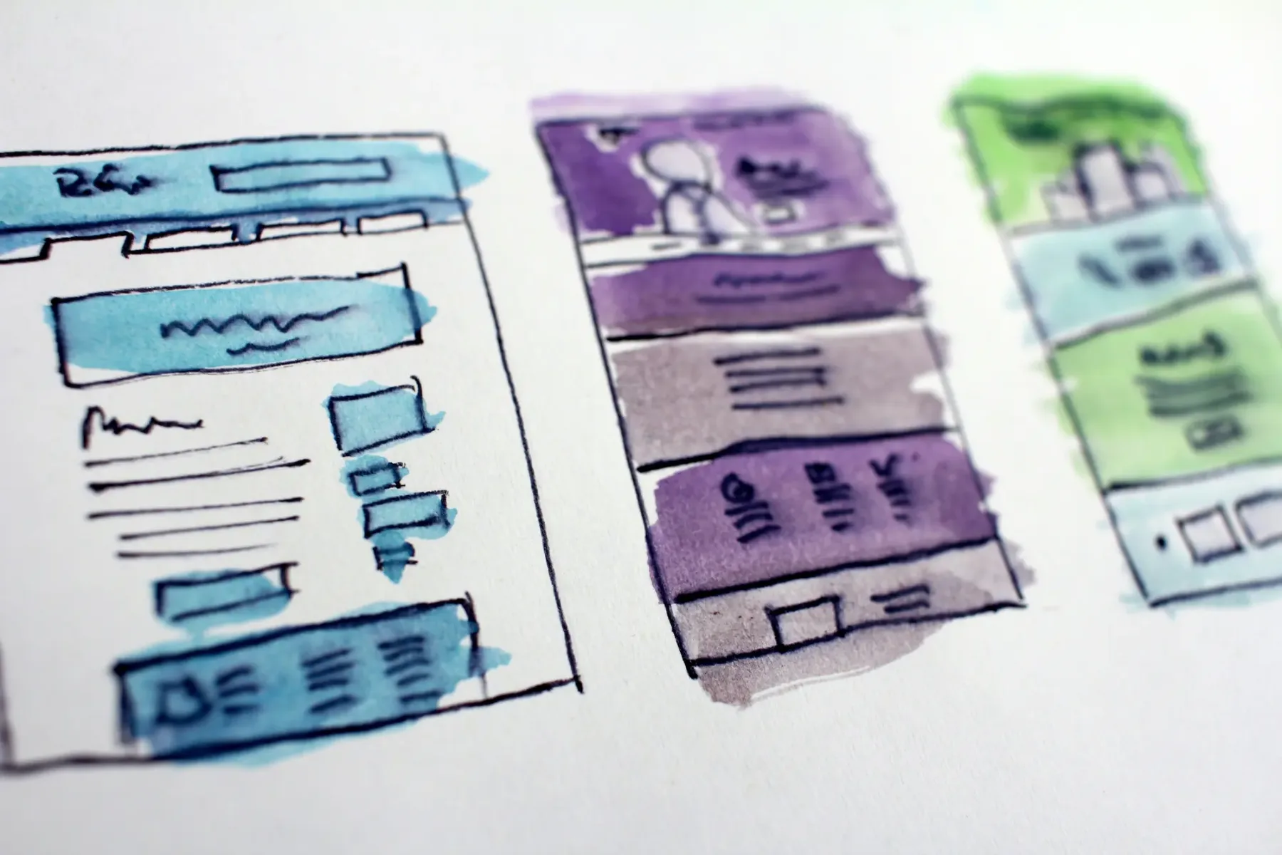
Slideshows usually exist because several teams each wanted the top spot. The result is a banner that changes before anyone finishes reading it. Anything on slide two or three depends on the visitor sitting still long enough to see it, and people browsing a homepage rarely do.
Pick one message for the hero. If you really have several promotions running, stack them as static blocks further down the page, where shoppers can scan them at their own pace.
3. Three buttons fighting for the same click
"Shop women," "Shop men," "New arrivals," "Take the quiz," and "Join the club" all in the first screen means none of them stands out. When every button is styled as the primary action, the visitor has to stop and decide, and a pause is often where they drift away.
Choose one primary action for the top of the page. Secondary paths can be text links or smaller outlined buttons. If you sell to clearly separate audiences, a simple two-way split works, but keep it to two.
Navigation that makes shoppers work too hard
A good menu lets someone who has never heard of you find the right product in two or three clicks. A bad one makes them guess.
4. Menu labels that only make sense to your team
Internal names leak into navigation all the time. Collection names like "The Essentials Edit" or "Studio Line" mean something to the people who planned the launch. To a shopper, they're puzzles.
Label menu items the way customers describe products: by type, use, or problem. Keep branded collection names, but put them inside a clear parent category instead of at the top level. If your mega menu has more columns than a shopper can take in at a glance, that's a sign it needs trimming, not more links.
5. A search bar hidden behind an icon
Visitors who search usually know what they want, which makes them some of your most valuable traffic. Many Shopify themes tuck search behind a small magnifying glass icon, especially on mobile. Some people find it. Plenty don't bother.
If your catalog is larger than a handful of products, consider showing an open search field in the header on desktop and making the search icon easy to spot on mobile. Then check what people type. Shopify's report on top online store searches will tell you which products they expected to find and whether results matched.
Speed and mobile issues
These two tend to go together, because the heaviest homepages are usually at their worst on a phone with a patchy connection.
6. A homepage that takes too long to load
The usual suspects are an autoplaying background video, uncompressed hero images, and a pile of app scripts that each add their own weight. Apps are the sneaky one. A store can pick up review widgets, chat tools, popups, and tracking pixels over a couple of years. Older apps that edited theme files directly can also leave code behind after they're uninstalled.
Start by running your homepage through Google PageSpeed Insights and checking the web performance report in your Shopify admin. Then work through the list:
Replace a background video with a well-compressed still image unless the video is doing real selling work.
Serve hero images at the size they're displayed, not the size they came off the camera.
Audit installed apps and remove anything you no longer use, including leftover code in your theme files.
Lazy-load sections below the fold so the first screen appears first.
7. A mobile layout that was designed on a desktop
It's common for a homepage to be reviewed on a big monitor and only checked on a phone right before launch. That's how you end up with hero text sitting on top of the most detailed part of the photo, tap targets too small for a thumb, and a product grid that shrinks cards until the prices are hard to read.

Review the homepage on an actual phone, not just a resized browser window. Use a separate mobile image for the hero if the desktop crop doesn't work. Make sure the main button sits within easy thumb reach, and check that nothing important is hidden behind a sticky header or a chat bubble.
Missing trust signals and hidden friction
A first-time visitor doesn't know you yet. The homepage has to answer the quiet questions they won't ask out loud.
8. Shipping and returns info buried in the footer
Shipping cost and return policy are among the first things a cautious shopper wants to know. If the only place to find them is a policy page linked in tiny footer text, some people will assume the answer is bad news.
A slim announcement bar or a short row of benefit icons near the top can handle this. Keep it factual and specific to your actual policy, like the free shipping threshold you really offer or the number of days customers really have to return something. If the policy has conditions, link to the details rather than overselling it.
9. Social proof that's missing, vague, or hard to believe
"Loved by thousands" with no reviews anywhere on the page doesn't reassure anyone. Neither does a testimonial carousel with first names only and no way to see where the quotes came from.
Pull real, verified reviews from your review app onto the homepage, ideally tied to specific products. Press mentions work if they're real and recent. The rule is simple: only show proof you can back up. Invented or inflated claims tend to get noticed, and they undo trust fast.
10. Popups that fire before anyone has read a word
An email signup offer that covers the page the moment it loads interrupts someone who hasn't decided whether they like you yet. On mobile, it can hide the entire screen.
Delay the popup until the visitor has scrolled or spent some time on the site, or trigger it on exit intent on desktop. On mobile, a small slide-in or banner is often a better fit than a full-screen overlay. And make the close button easy to find.
How to find out which of these are costing you sales
You probably don't have all ten problems. The goal is to find the two or three that matter most for your store and fix those first.
Start with the data you already have
Shopify's analytics and GA4 will show you how many sessions land on the homepage, how many move on to a collection or product page, and how that differs between mobile and desktop. A big gap between devices usually points to a mobile layout or speed problem. A high exit rate from the homepage points to something above the fold.
Watch real sessions
Heatmaps and session recordings, from tools such as Microsoft Clarity or Hotjar, show where people click, how far they scroll, and where they hesitate. Twenty minutes of watching recordings will often reveal issues that no dashboard shows, like visitors repeatedly tapping an image that isn't a link.
Change one thing at a time
If you rewrite the hero, swap the menu, and add a new popup all in the same week, you won't know which change helped or hurt. Make one meaningful change, give it enough traffic to judge, and then move to the next. For higher-traffic stores, a proper A/B test is worth the setup time.
A homepage rarely fails because of one dramatic mistake. It's usually a handful of small issues stacking up until shoppers stop trying. If you'd like a second set of eyes on yours, our team runs conversion audits for Shopify stores and turns the findings into a prioritized list of fixes.