Why Mobile Converts Worse Than Desktop on Shopify
Mobile brings the traffic and converts far below desktop. How to tell normal behaviour from a store that is awkward on a phone, and what to fix first.
Open your Shopify analytics, split conversion rate by device, and there it is: mobile brings most of the traffic and converts at a fraction of desktop. Almost every store sees some version of this. The useful question is not whether you have a gap, but how much of it is normal shopping behaviour and how much is your store being awkward to use on a phone. Here's how to tell the difference, and what to fix when it's the second one.
Some of the gap is normal
Before you tear up the mobile layout, understand what you're measuring against.
People research on a phone and buy later on a laptop. That purchase gets credited to desktop, and the phone session looks like a failure.
Mobile sessions are often shorter and more casual. Someone browsing in a queue is not in the same state as someone at a desk with a card out.
Traffic mix differs by device. Social and display traffic skews mobile and converts worse everywhere, including on desktop.
Repeat customers, who convert best, often sit on desktop or in an app context.
So a mobile rate below desktop is expected. A mobile rate that is a small fraction of desktop, or one that has dropped since a theme change, is a problem you can fix.
Find out how big your gap really is
Split the funnel, not just the final number. In your Shopify admin you can see sessions that added to cart, reached checkout, and converted. Compare those three steps on mobile and desktop.
The shape tells you where to look:
Mobile loses people before add to cart, so the product page or the browsing experience is the issue.
Mobile adds to cart at a similar rate but drops at checkout, so the problem is in the cart, the forms, or the payment step.
Mobile converts badly only on certain landing pages, which usually means one template, not the whole store.
Also compare the same channel on both devices. If mobile email traffic converts well and mobile paid social converts terribly, you have a traffic problem rather than a mobile problem.
Where mobile loses people

The first screen
On a laptop the hero, the headline, and a product row might all be visible at once. On a phone the first screen might be a logo, an announcement bar, a cookie banner, and the top third of an image. Open your store on a phone and ask what a stranger learns in the first two seconds. If the answer is nothing, that's the first fix.
Tap targets and the thumb
Most phone use is one handed, and the comfortable area is the lower middle of the screen. Buttons that sit at the top, variant swatches packed tightly together, and links placed inside paragraphs all cause mis-taps. A mis-tap on a product page is not a disaster. A mis-tap on the quantity selector during checkout often is.
Forms and keyboards
This is where a surprising amount of mobile revenue goes missing. Check that email fields bring up the email keyboard, that phone fields bring up the number pad, that autofill works for address and card details, and that the postcode field accepts the formats your customers actually use. Every field that fights the phone adds a reason to quit.
Speed on a real connection
Desktop testing hides this completely. A page that loads instantly on office wifi can take many seconds on a train. Test on mobile data, not wifi, and remember that the people with the worst connections leave before they ever appear in your funnel as a drop-off.
Interruptions
A popup that covers a phone screen is far more disruptive than one on a desktop, where the page behind it is still visible. The same goes for a chat bubble parked over the add to cart button, a sticky banner eating a third of the screen, and a cookie notice with a tiny close button. Count how many things a mobile visitor has to dismiss before they can shop. If it's more than one, cut it down.
Images and zoom
Phones are where photography matters most, because the screen is small and the customer cannot handle the product. Pinch zoom should work smoothly, the gallery should be swipeable, and the first image should be legible at thumbnail size rather than a wide lifestyle shot where the product is a speck.
The checkout step on mobile
Shopify's checkout is already reasonably mobile friendly, so look at what your store adds around it:
Are accelerated payment options and wallets available and visible on the cart page, so people can skip typing entirely?
Is guest checkout obvious rather than hidden under a login form?
Have you added extra required fields that make the form longer than it needs to be?
Does the cart page let people change quantity without a full page reload?
Then place a real order on a phone, on mobile data, with a real card, and pay attention to every moment you feel mild irritation. That irritation is your conversion rate.
Test like a customer, not like the person who built it
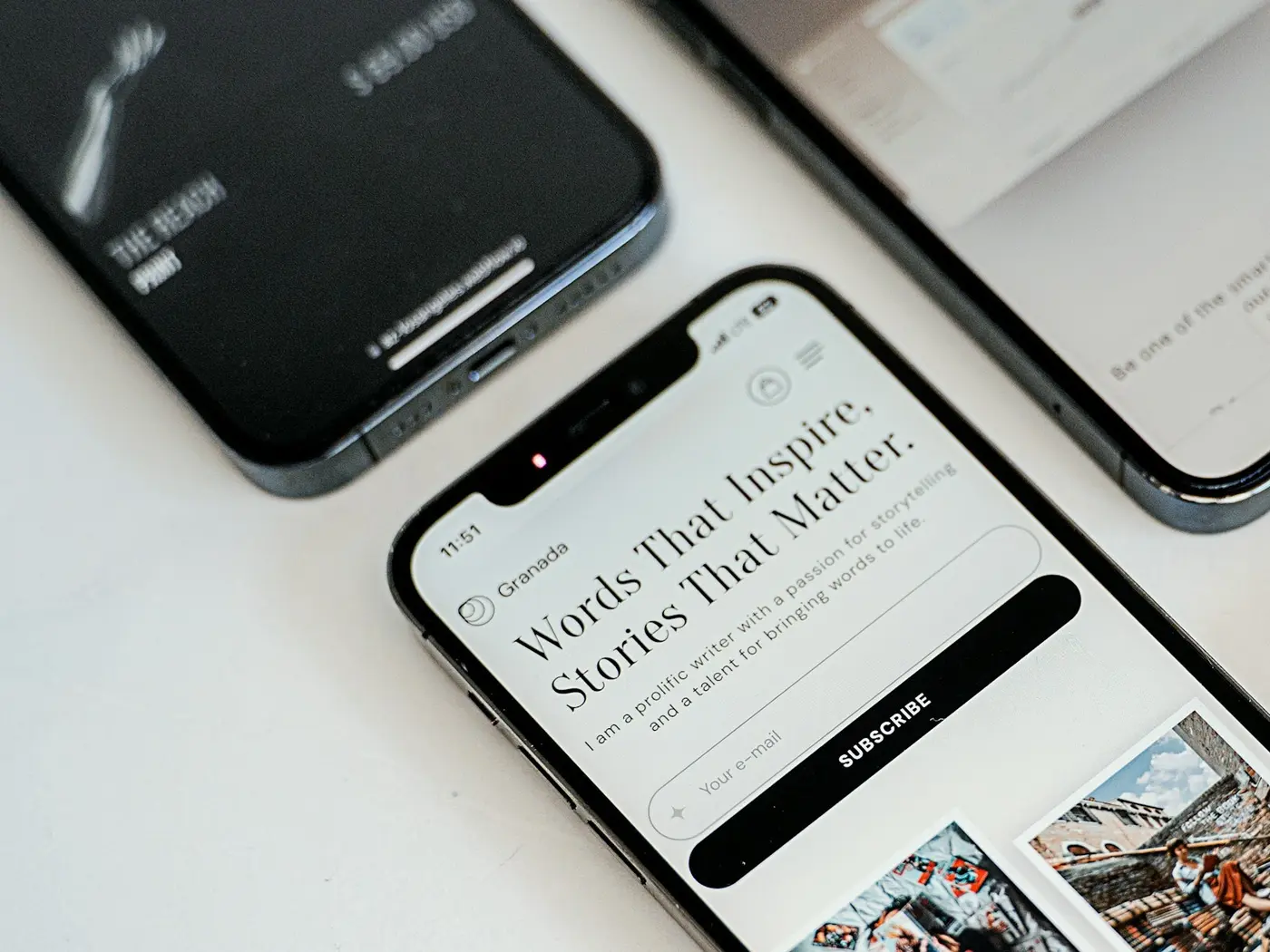
A browser window resized to phone width is not a phone. It has a mouse, a fast connection, your saved logins, and no notifications. Proper testing means a real device, one hand, outside your office wifi, and ideally an older phone than yours. Borrow one from someone in the warehouse. The experience on a three year old Android is the experience a lot of your customers are having.
Session recordings help here too. Watching ten mobile sessions will show you the rage taps, the pinch zooming on a size chart, and the moment someone scrolls past your buy button without seeing it.
What to fix first
Anything broken or blocked: forms that fail, buttons covered by sticky elements.
The buy area: price, variants, and add to cart reachable without hunting.
Interruptions: popups, banners, chat widgets.
Speed on the three templates that get the most mobile traffic.
Photography and zoom.
Layout polish, which is where most teams start and should not.
Measure after each change, by device, with the funnel split rather than the blended number. Mobile will probably still convert below desktop when you're done, and that's fine. The goal is to remove the part of the gap that you created.
If you'd like someone to go through your store on real devices and come back with a prioritized list of mobile fixes, that's part of what we do in our UI/UX design services.